A self-initiated project aimed at making Spotify for desktop more visually appealing, while also improving the user experience and functionality of the app. I majorly revamped the Saved Music section, and the Artist / Album pages in order to be more functional and display more information.

Browse
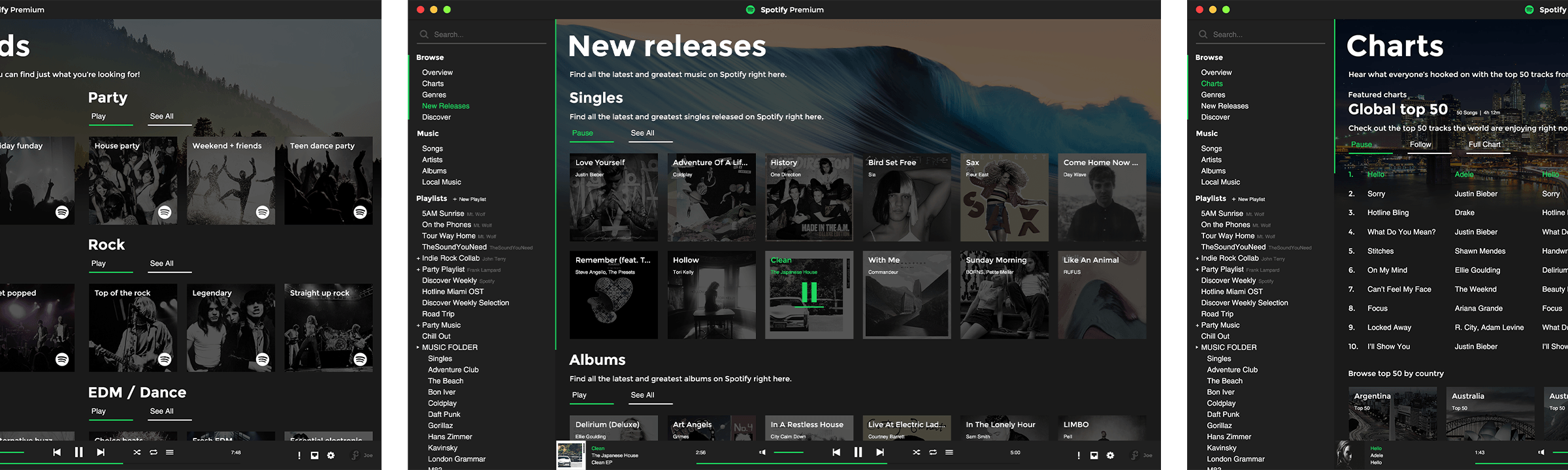
The browse function of Spotify was overhauled to more immediate functionality on each of the main pages. On the Browse home page, playlists relating to time and day are more prominent, and there is a bigger focus on Discover Weekly to get more users engaged.
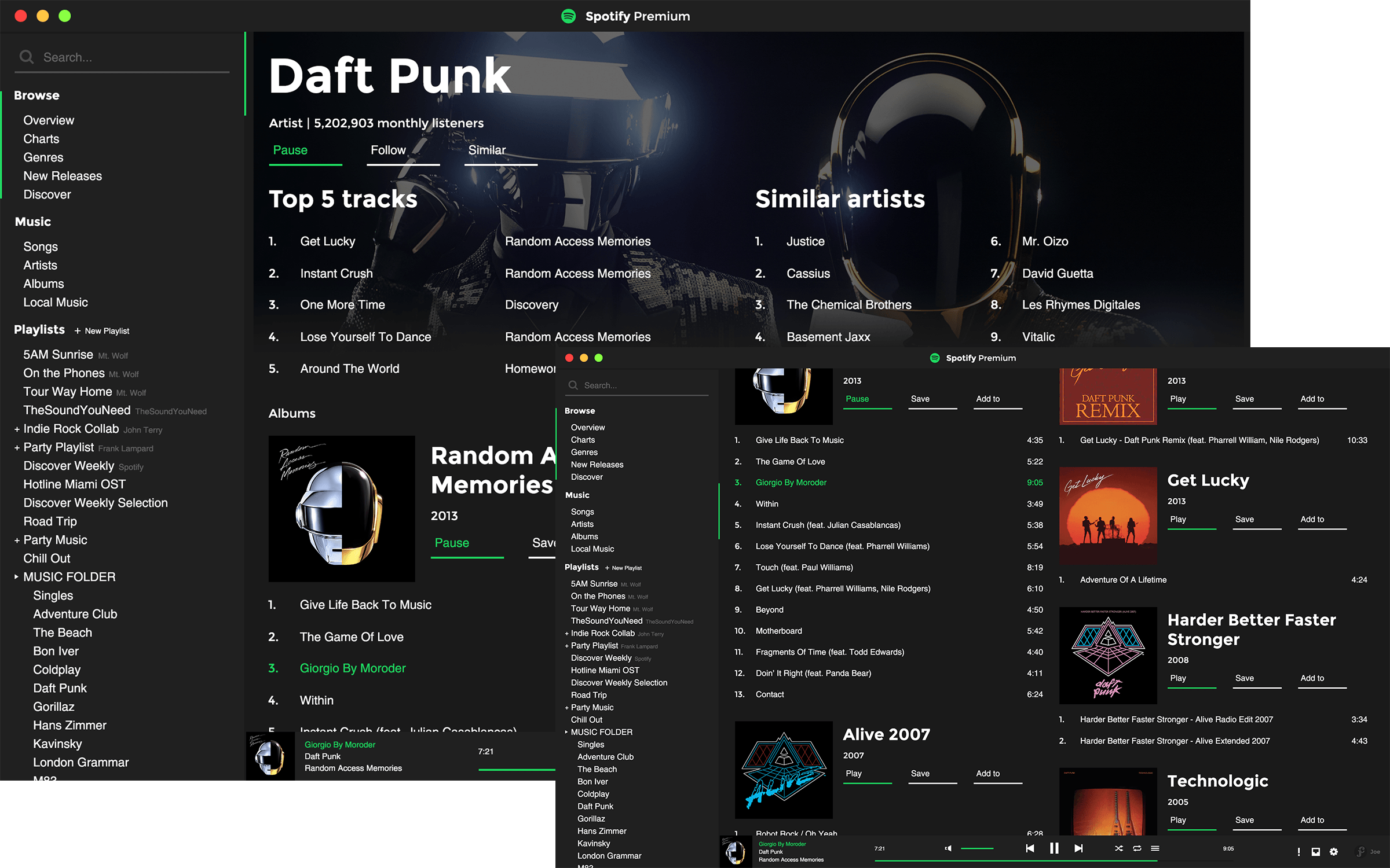
Artists
Artist pages weren't changed much functionally, but visually they were overhauled. Albums and singles are now mirrored left and right meaning the user doesn't have to scroll all the way down to find singles.
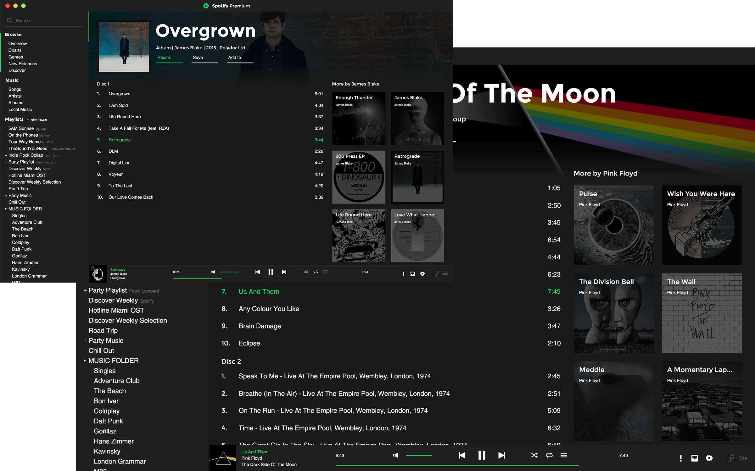
Albums
Albums have been changed to show related content down the right side.
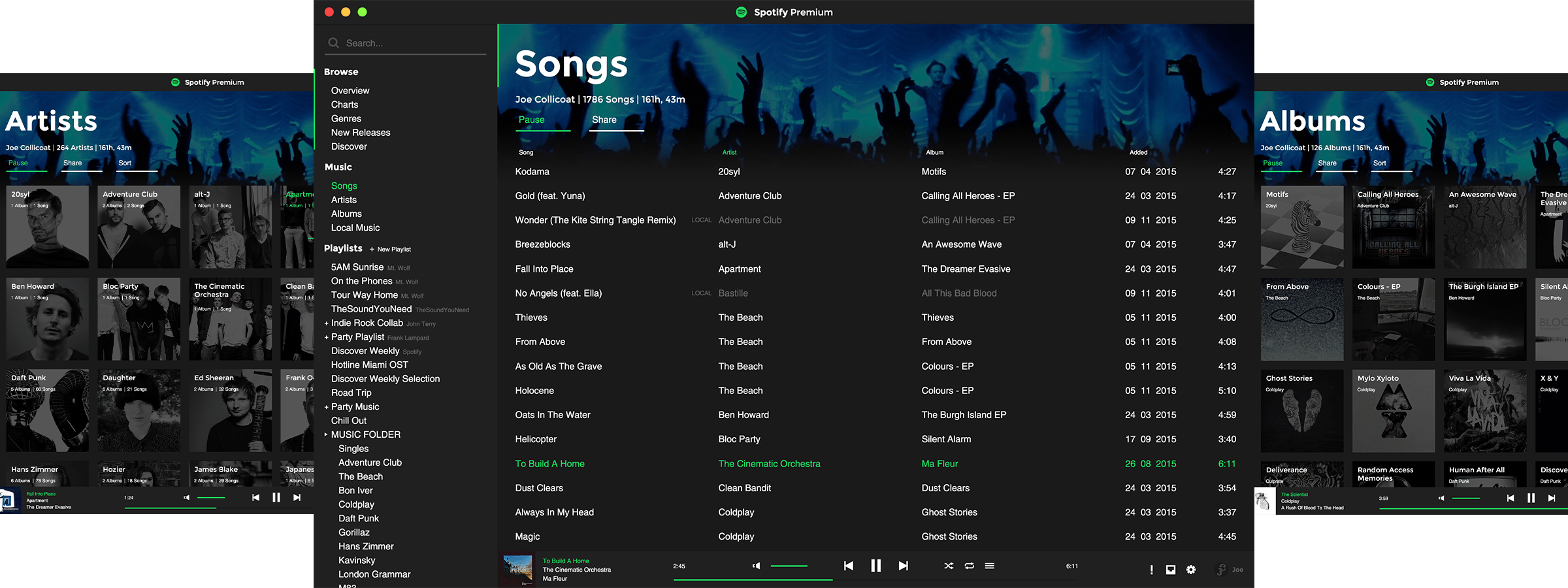
Saved Music
The Saved Music section was changed to be more functional. Essentially it's now laid out as a playlist but with a couple of different views (Artist and Album), and local files integrate straight into the saved song list.
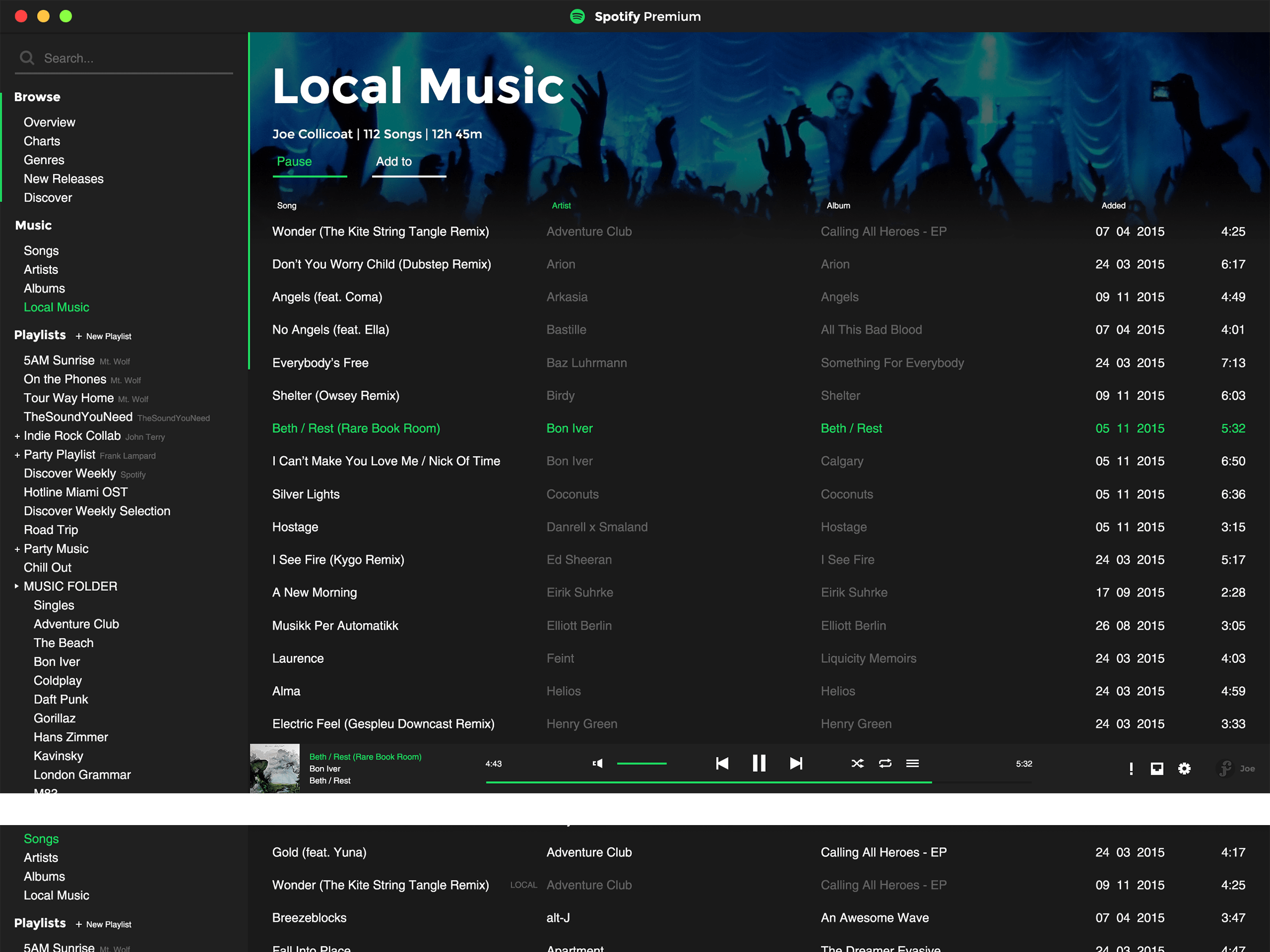
Local Music Integration
Currently local files in Spotify are basically hidden away in their own playlist of sorts. Bringing them into the Saved song list is far more useful.
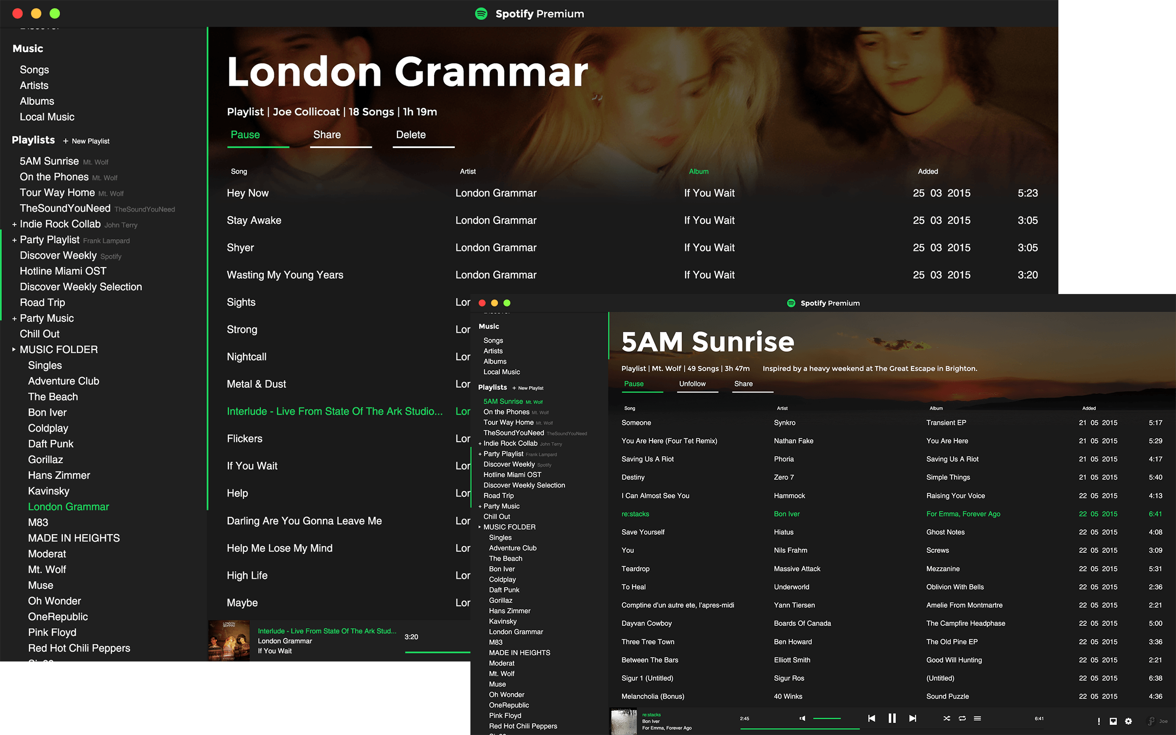
Playlists
Playlists have been updated slightly to include more information, especially in collaborative playlists where users can see more information about who's contributing which songs.

Control Bar
The control bar has been re-designed to save space elsewhere on the screen. It now incorporates the user, inbox and settings controls.

Interface
Small interface elements have been re-designed to be more functional and save space for the rest of the UI.
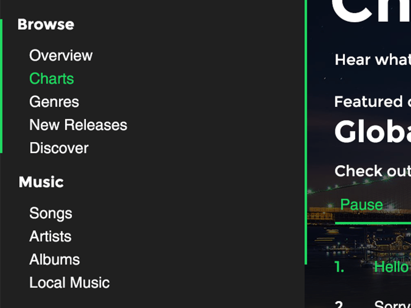
Browse navigation moved to the sidebar to remove clutter in the main content area.
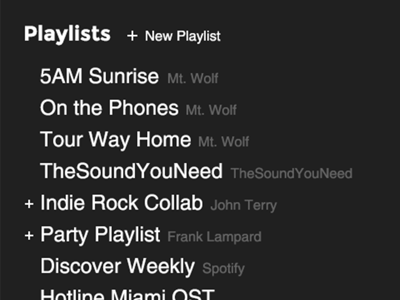
Collaborative playlists marked with a +, while followed playlists show the creator's name.

User panel moved to the bottom right, to save space at the top of the screen.